Why it’s important for your website to look professional
Have you DIY’d your website but you’re struggling on how to make your website look more professional? Don’t worry, I’m going to share with you my top 4 design tips to help you take your website from amateur to pro.
So you’ve picked your platform, you’ve written your content and you’ve got it all on your website, but something just doesn’t seem right. You know first impressions are important, but how to make your website look more professional is proving more difficult than you thought.
Whilst content is king when it comes to websites, aesthetics are still super important too. It contributes to accessibility and user experience and which helps people to learn to trust you,as someone they want to buy from.
Taking your website from amateur to pro standards isn’t as difficult as you might think, and with some simple but hella effective tips, your website could have the ultimate glow up.
Here are 4 tips on how to make your website look more professional:
Tip #1 : Stick to the golden rules of fonts
Your website should be mainly text and if you want your visitors to pay attention and actually read what you have to say, you’re going to have to make it super easy for them to read. The bane of my existence as a website professional are website templates that use whimsical, script fonts that are impossible to read for vital pieces of information like headers and body text. Whilst it looks pretty, it doesn’t do you or your website any favours when it comes to legibility or accessibility. Some of your visitors will find it impossible to read due to additional needs like visual impairments or dyslexia, and some simply just won’t be bothered to read it.
To ensure you’re making it nice and easy for your visitors to read all your valuable information, here are my two golden rules for fonts:
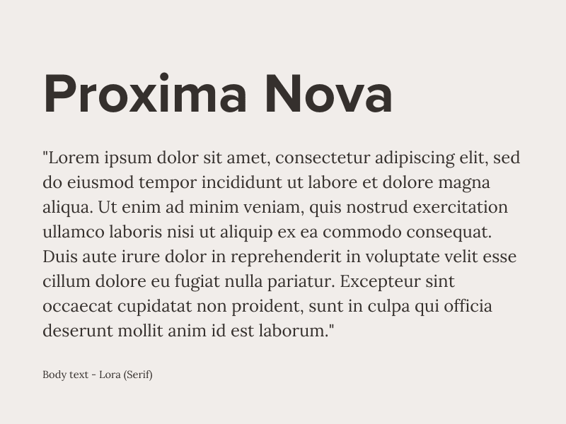
Rule 1: Headers should be bold and easy to scan. Use Sans Serif fonts like Bebas Neue, Helvetica or Proxima Nova.
Rule 2: Body text should be easy to read, at least 18px and have a line spacing of at least 1.5. Use Serif fonts like Georgia, Lora or Times New Roman.
Pick one font for your headers, and one for your body text, and use them throughout your website. Sticking to these rules will ensure readability, providing an even better user experience for everyone.

Tip #2 : Pick 2- 3 colours, maximum for your website
Choosing a colour palette for your website and sticking to it can really elevate your website. Lots of colours scattered all over the place screams DIY. But by sticking to a clear and well thought out colour palette that matches your branding, will make your website look 10 x more professional.
Tip #3 : Resize your images throughout your website
Images are so important to your website visuals, so you want to make sure you get this right. Optimised images are one of the key areas to boost SEO, but also to make your site look more professional. Small and pixelated images will look horrendous and like you don’t care about how you present your business. And images that are too big will slow your website down and make accessing your website difficult for your visitors, giving them a bad user experience. Whether you’re using professional photography or stock photos, make sure your images are the right size for the space that you have. Not too big, and not too small. Just right.
Tip #4 : Give your text and images room to breathe
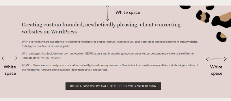
The biggest mistake I see on DIY websites is not enough white space around your content, and in my opinion, white space is the holy grail of professional website design. Packing everything closely together to make it all fit on the screen so people don’t have to scroll is impossible, but will only result in bad user experience. Each piece of content, whether it’s an image or text, needs to have enough space around it so that it can shine in its own right. Don’t be afraid of a little white space. It will take your design to new levels.

Keeping things simple on your website is key to making your website look more professional. Overcomplicating the design and trying to throw everything you can think of at it can have the opposite effect of what you’re trying to achieve.
Whilst having a professional web designer create your site for you has its benefits, whilst you’re on the DIY era of your website journey, these simple yet effective techniques can help make your website look more professional.
If you found this blog article helpful and want more advice on how to make the most of your website, you can join The Website Glow Up membership for more tips, prompts and chances to get your website personally reviewed by me.

